5 min read
Why most e-commerce redesigns fail
Most redesigns focus on aesthetics. The ones that succeed focus on clarity, structure, and decision-making.
And how UX actually drives revenue
Published:
January 20, 2026

Mark Haedo Martinez
Lead UX/UI Designer
Why most e-commerce redesigns fail (and how UX actually drives revenue)
Most e-commerce redesigns don’t fail because of bad design.
They fail because they optimize the interface instead of the decision.
The UI gets cleaner. The brand feels more premium. Animations are smoother.
But conversion barely moves.
Because users weren’t struggling with aesthetics.
They were struggling to understand.
The problem isn’t the interface
A lot of redesigns start from the wrong place.
Moodboards. References. Visual upgrades.
But the real issue is almost never visual.
It’s structural and most companies never question that layer.
Users land on a page and don’t immediately understand:
what’s being offered
what the differences are
what they should choose
So they compare. They hesitate. They leave.
Average conversion rates still sit around 2–3%.
Cart abandonment is still close to 70%.
Not because design hasn’t evolved, but because most experiences are still built around pages instead of decisions.
UX is about decisions, not design
UX is often treated as a layer you apply at the end.
In reality, it’s the thing that defines how a business performs.
Every step in a journey either helps the user move forward or slows them down.
There’s no neutral.
If a user needs to re-read, compare too much, or second-guess a choice, friction is already there.
And friction is what kills conversion.
Good design doesn’t increase revenue.
Reduced friction does.
Conversion is not a traffic problem. It’s a clarity problem.
Where revenue is actually lost
Most e-commerce platforms leak performance in the same places.
Offers are unclear.
Too many options presented without structure.
Information is there, but not organized.
The journey feels disconnected from one step to the next.
And then the checkout adds another layer of friction:
unnecessary fields
repeated inputs
lack of feedback
Individually, these are small things.
Together, they create doubt.
And doubt is enough to stop a purchase.
The average cart abandonment rate is still close to 70%, mostly driven by friction in checkout and unclear flows.
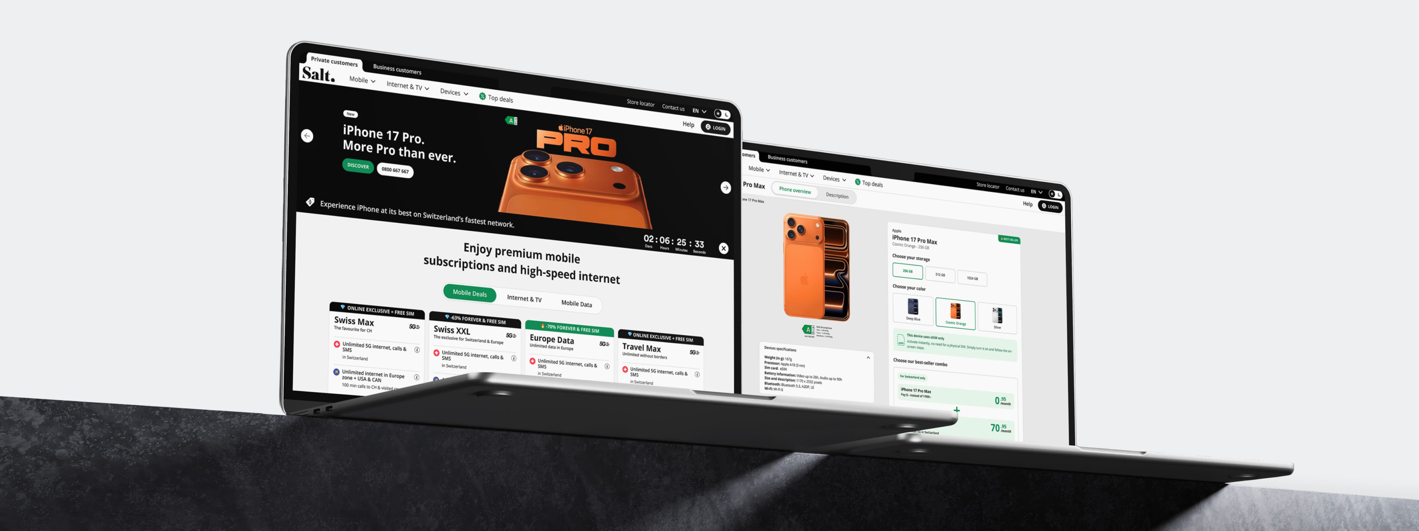
Case Study: Rethinking UX at Scale (Salt Mobile)
At Salt Mobile, the problem wasn’t how it looked.
It was how it worked and how users were expected to decide. Clarity wasn’t a design improvement. It was a business requirement.
With over 1.7 million mobile users and a growing fiber business, the platform had evolved in layers. Different products, different structures, different logics.
From a user perspective, it felt fragmented.
Plans were hard to compare.
Bundles weren’t always clear.
The journey between mobile and fiber lacked continuity.
The issue wasn’t visual consistency.
It was how everything connected.
What we focused on
Instead of redesigning the interface, we reworked the system behind it.
simplifying how offers are structured
making comparisons clearer and faster
aligning journeys across products
reducing unnecessary steps in key flows
At the same time, we evolved the design system to ensure consistency and scalability across the entire ecosystem.
Not as a visual layer, but as a way to reduce cognitive load.
→ Explore the full case study: Salt Mobile Project
The Shift
The goal wasn’t to make the experience more beautiful.
It was to make it easier to understand, faster to navigate, and more coherent from start to finish.
Because once the experience becomes clear, conversion becomes a consequence.
What actually moves the needle
If the objective is growth, UX needs to be approached differently.
Not as a redesign.
As a system.
That means:
Start with the offer.
If it’s not clear, no interface will fix it.
Design flows, not pages.
Conversion happens across the journey.
Reduce decisions, don’t multiply them.
Too much choice creates hesitation.
Focus on friction.
Where users slow down is where revenue is lost.
Build consistency.
The more predictable the experience, the faster users move.
One Simple Reality
Users don’t convert because something looks good.
They convert because it makes sense.
And most of the time, improving performance has nothing to do with adding more.
It’s about removing what gets in the way.
Most companies redesign interfaces.
Very few redesign how people decide.