This project is currently confidential. Enter password to access

Lead UX/UI Designer & E-commerce Manager
End-to-end ownership
E-commerce Platform Redesign Design System & Scalability UX Optimization & Performance CMS Migration (Drupal to Magnolia)
2026
Lausanne, Switzerland
Context & Business Challenge
Redesigning Salt’s e-commerce platform and building a scalable design system to support long-term growth. Salt’s digital platform was undergoing a migration to Magnolia CMS to enable greater scalability and a modular architecture. However, the experience lacked consistency and structure, making content difficult to manage and offers hard to understand. The objective was to simplify the offer architecture, improve the customer journey, and establish a scalable design system across Salt’s e-commerce ecosystem.

Scalable CMS architecture
Built on Magnolia components to enable flexible and scalable page creation.

Reusable components
Standardised components to ensure consistency and faster delivery.

Conversion-focused layouts
Structured layouts and clear hierarchy to improve decision-making and conversion.

Consistency across journeys
Unified visual language across mobile, fibre, and e-commerce experiences.
From strategy to execution, the project bridges creative direction,
system thinking, and e-commerce performance.
Platform Audit & UX Issue
An audit of the platform revealed inconsistent layouts, unclear hierarchy, and fragmented user journeys. Users struggled to understand offers and plan differences, increasing friction and reducing confidence during the purchase process. These insights defined the foundation for restructuring the experience and improving clarity across the platform.
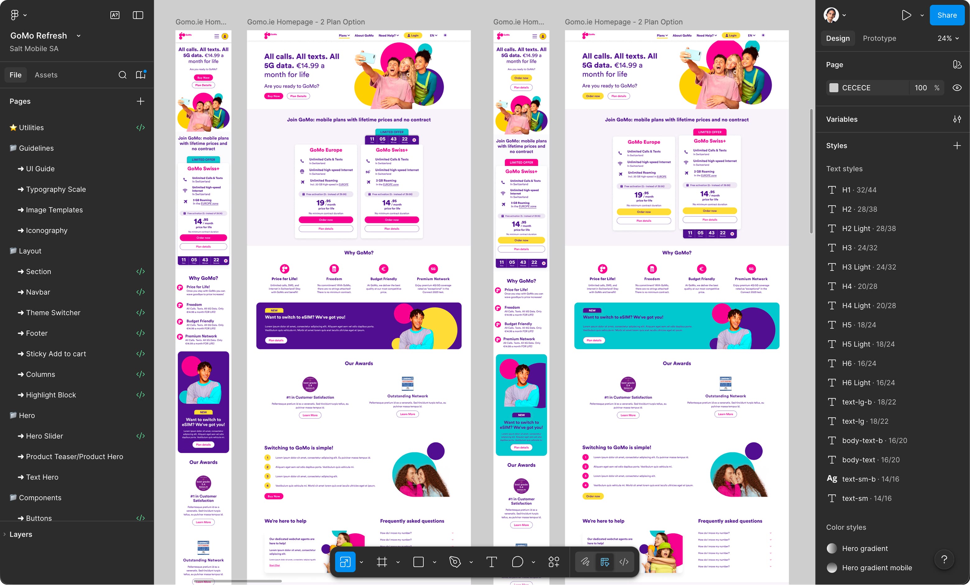
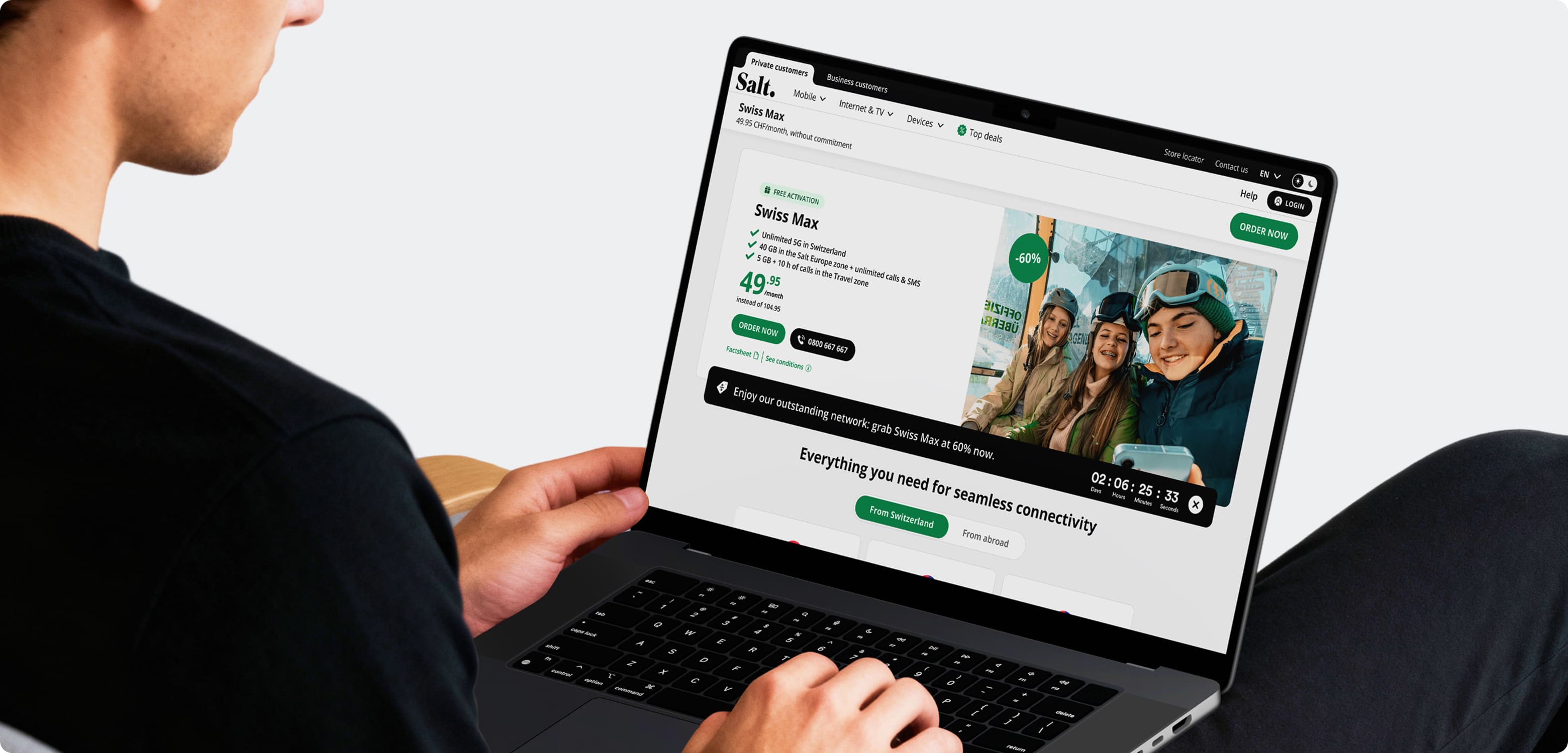
Homepage Drupal → Magnolia

Devices page Drupal → Magnolia
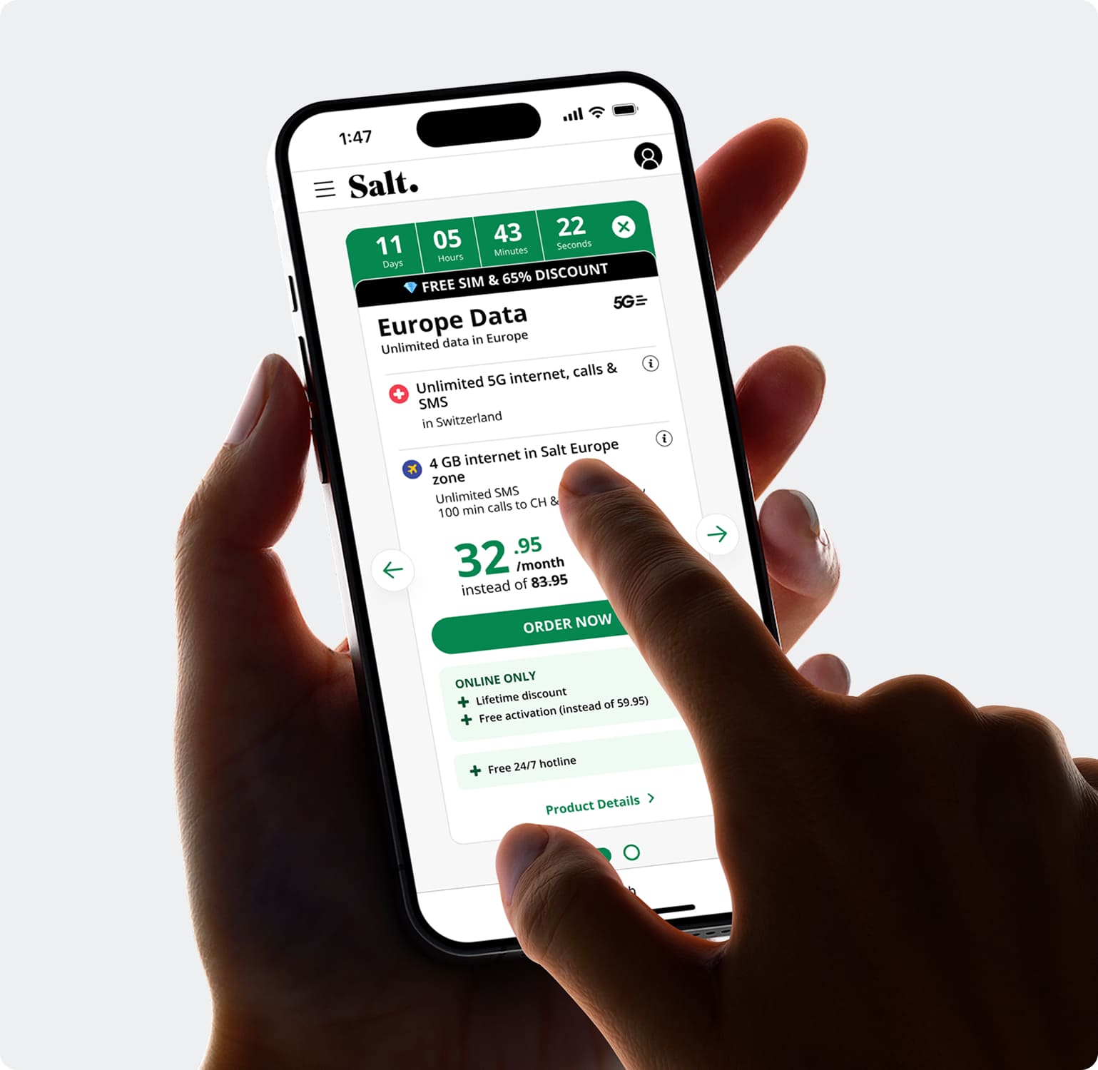
Simopage Drupal → Magnolia

Page zoning & layout structure
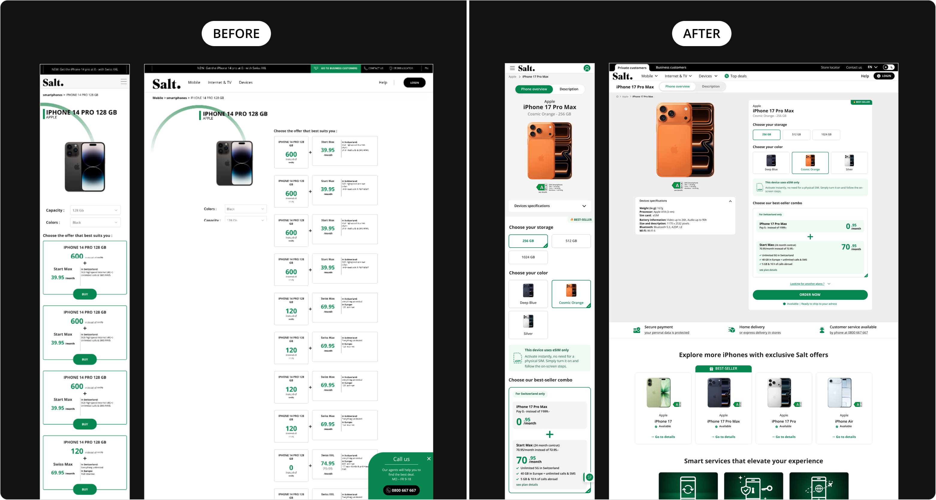
Based on audit insights, a new page structure was designed to improve clarity and consistency across the platform. A modular zoning system introduced reusable sections, clearer content grouping, and simplified plan comparison. This approach ensured scalability within Magnolia while improving overall user understanding and navigation.

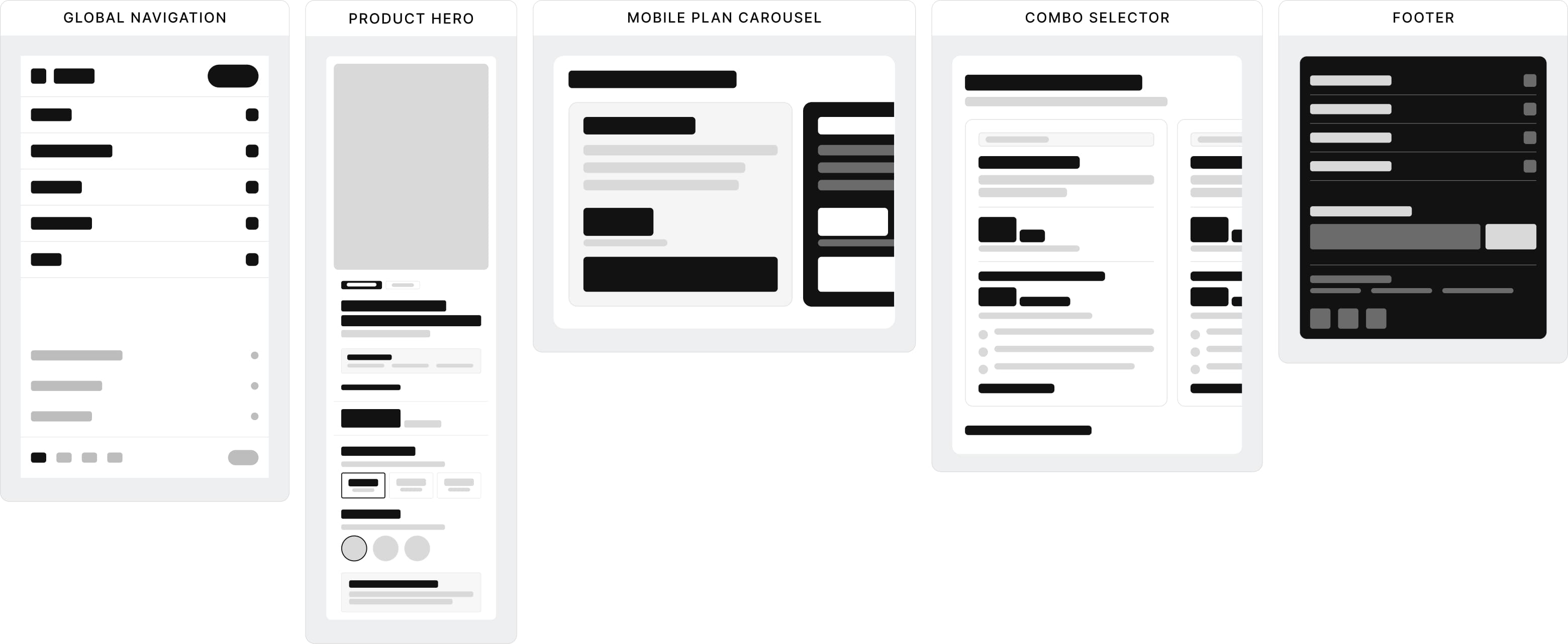
Responsive high-fidelity components
A modular component system was designed with a mobile-first approach to ensure consistency across all breakpoints. Each component was built to be reusable, scalable, and aligned with Magnolia’s architecture, enabling faster implementation and long-term maintainability.
High-fidelity wireframes
Wireframes translated the new structure into detailed layouts, defining hierarchy, interactions, and UX writing. They helped validate plan comparison, improve clarity, and align stakeholders across product, marketing, and engineering before final UI design.
Homepage: Improves offer clarity, simplifies plan comparison, and enhances product discovery.

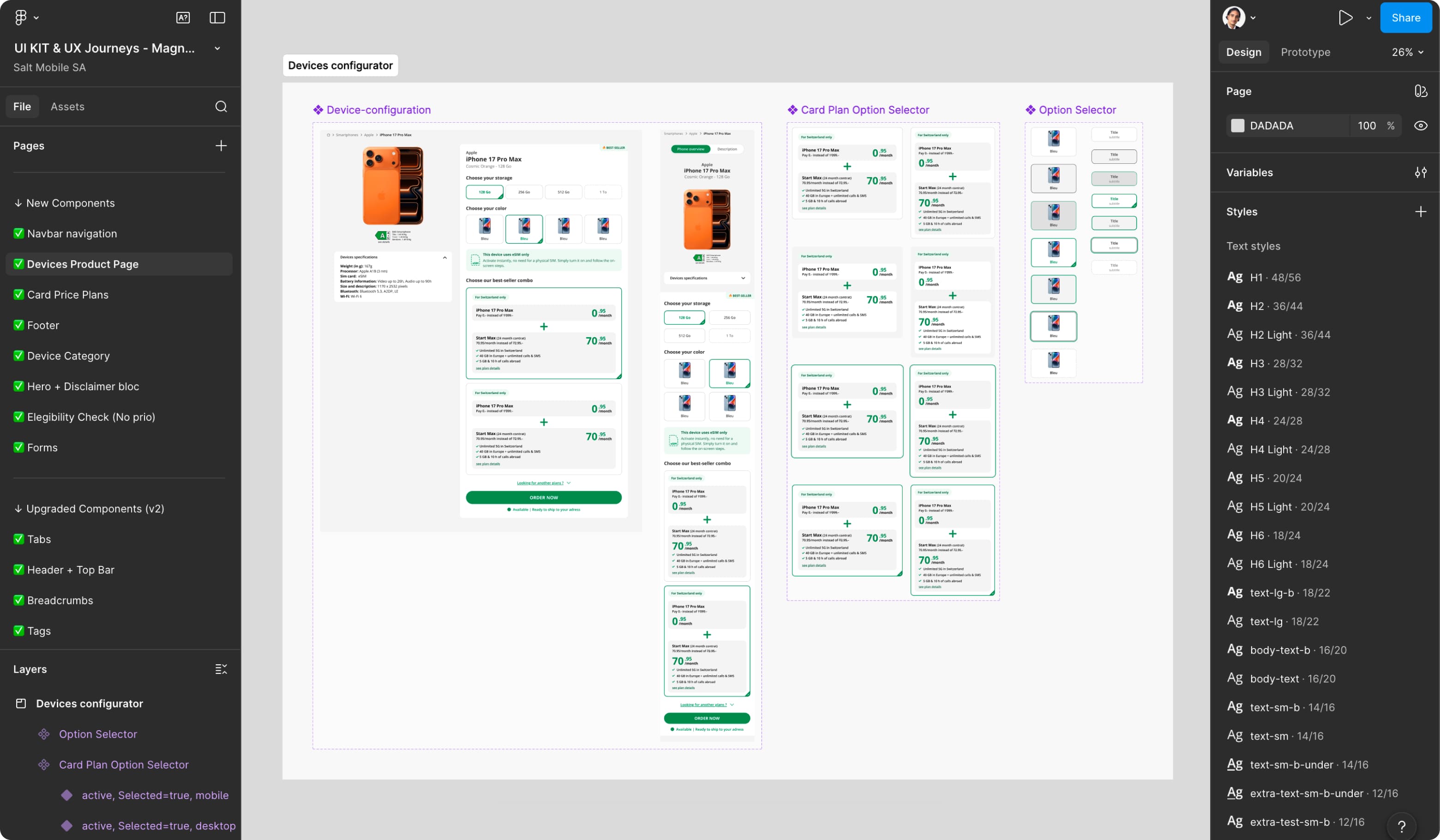
Device Product Page: Streamlines device configuration, clarifies plan selection, and accelerates purchase decisions.

Simo page: Clarifies plan details, simplifies comparison, and highlights key offer benefits.

Modular Component System
A modular component system was built to standardise layouts, interactions, and content structures across the platform. Designed for Magnolia, it enables reusable components, reduces duplication, and supports faster page creation and long-term scalability.
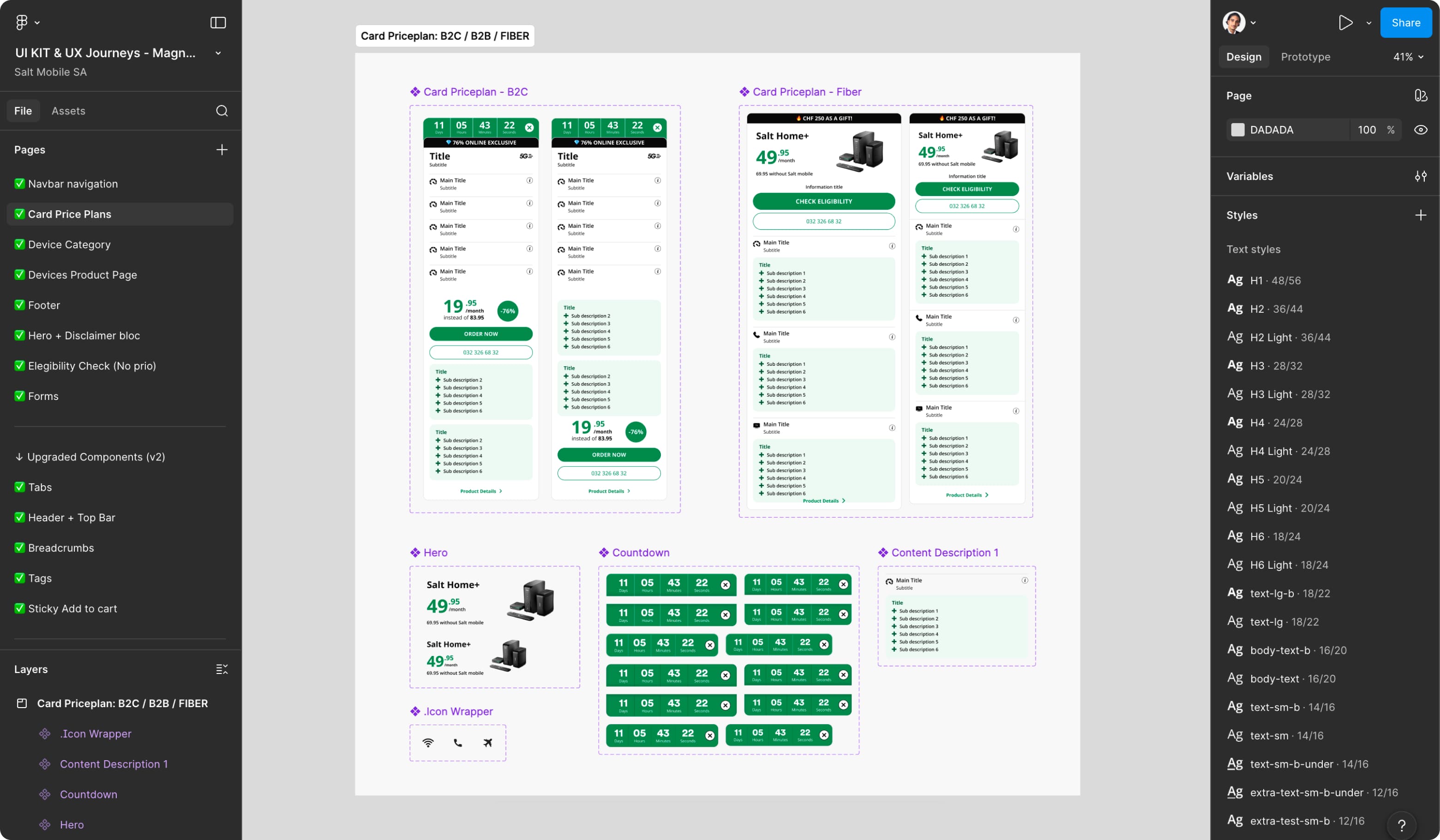
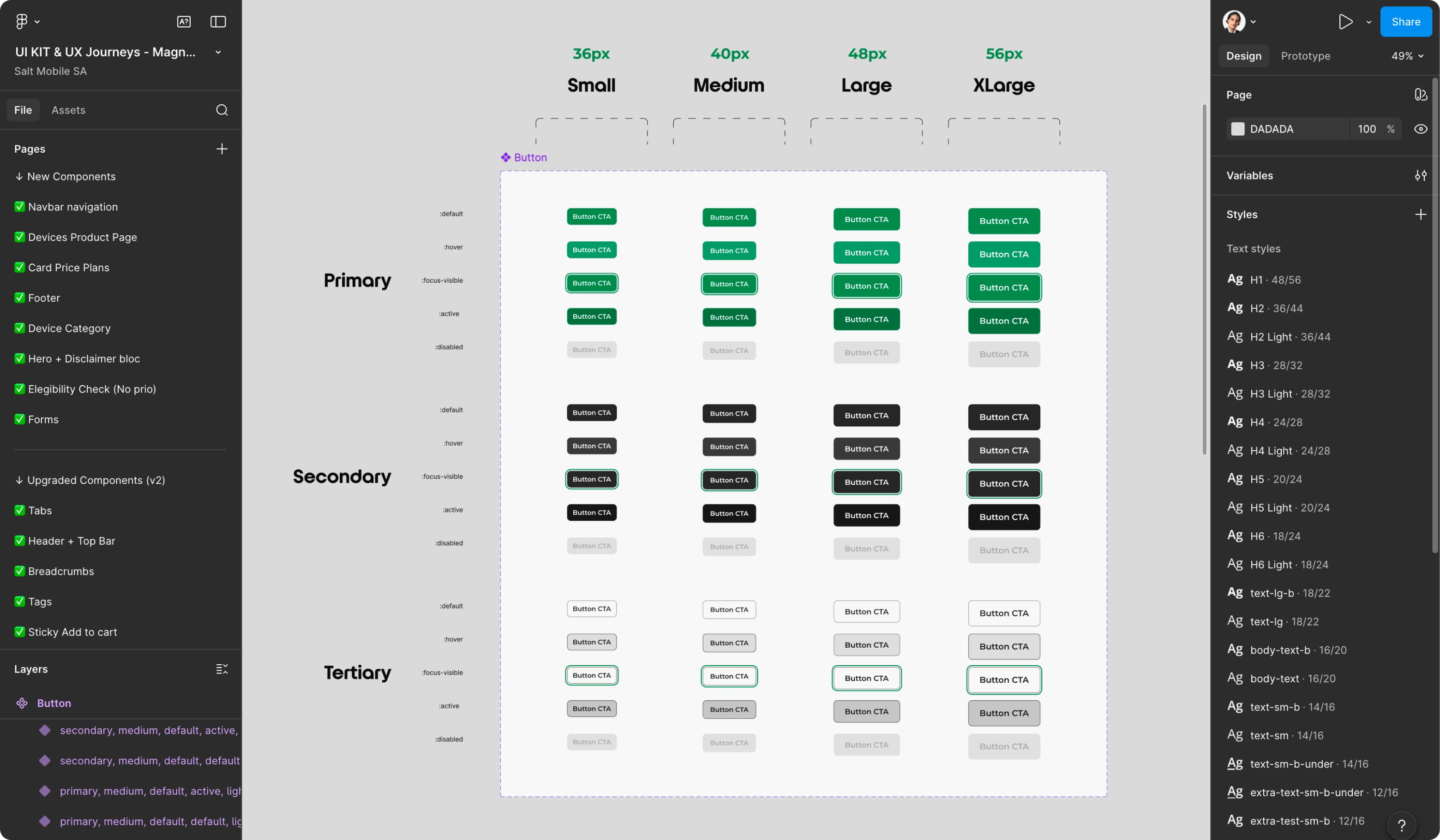
Reusable pricing components designed with multiple variants, states, and scalable configurations.
Button system defining hierarchy, sizes, and interaction states across the interface.
Device configurator components designed for Magnolia integration, supporting flexible product configuration and dynamic content.
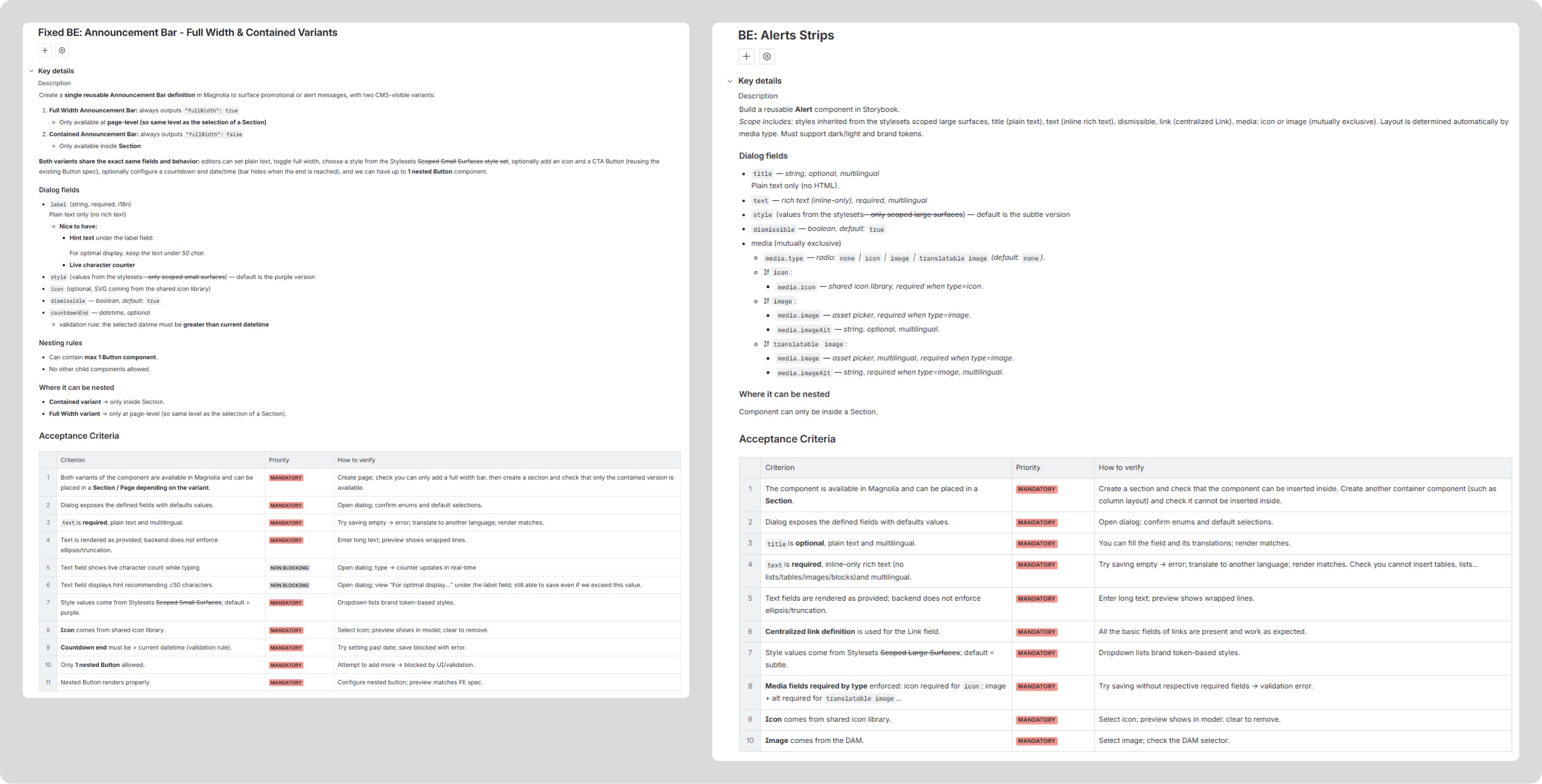
Component Specifications & Requirements
Each component was documented with detailed functional and technical specifications aligned with Magnolia CMS. This ensured accurate implementation, reduced ambiguity for developers, and maintained consistency across the platform.

Design System & Magnolia CMS Integration
The design system was built in alignment with Magnolia’s component architecture, ensuring seamless integration between design and development. Its modular structure enables scalable deployment across multiple brands while maintaining consistent UX foundations and brand-specific identities.


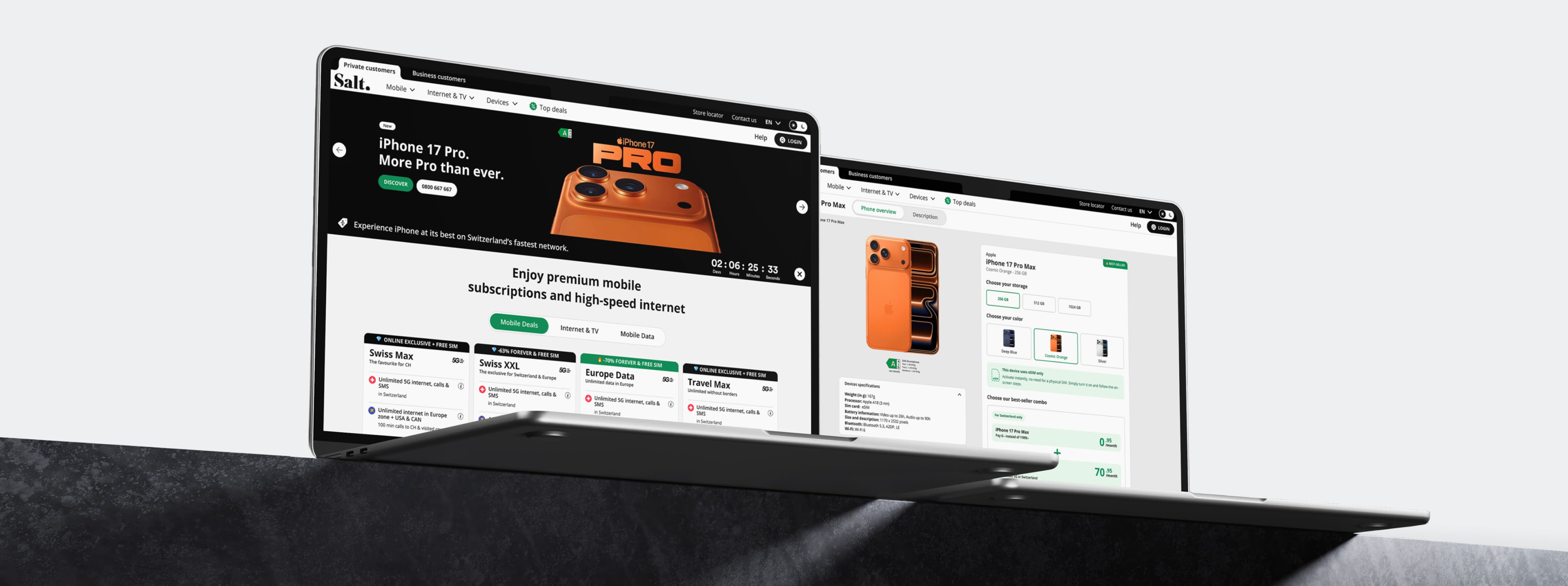
Final UI & Key User Journeys
The final experience delivers a clear, consistent, and conversion-focused journey across desktop and mobile. Simplified layouts, reusable components, and structured flows improve plan comparison, device configuration, and checkout, enabling users to move through the purchase process with confidence.


A scalable design system aligned with Magnolia CMS enabled faster page creation and consistent experiences across Salt’s digital ecosystem. Simplified structures and clearer offer hierarchies reduce friction across key purchase journeys, improving plan comparison and supporting faster decision-making. A modular component architecture increases content scalability, allowing teams to efficiently deploy new pages while maintaining consistency across multiple brands.
Faster page creation across teams
Improved clarity in plan comparison
Scalable system supporting multi-brand deployment